Branding
cyfrowy tubylec
“Cyfrowy Tubylec” (“Digital Native”) was a national scientific conference. The brand icon reflects the principles and specificity of the conference – the theme of individuals who, from birth, exist in the digital world, aiming to define and describe the impact of such upbringing on later behaviors in the school/university environment.
arturs team
The modernist style of the brand icon depicts several hidden elements: the shape of a shelf and shelves, the dark element in the middle symbolizes the solidity of the created solutions, and the technical construction style of the emblem reflects a flexible approach. The filling of some letters is a reference to the brand icon, as well as a unifying element of the entire project.
Arturs Team
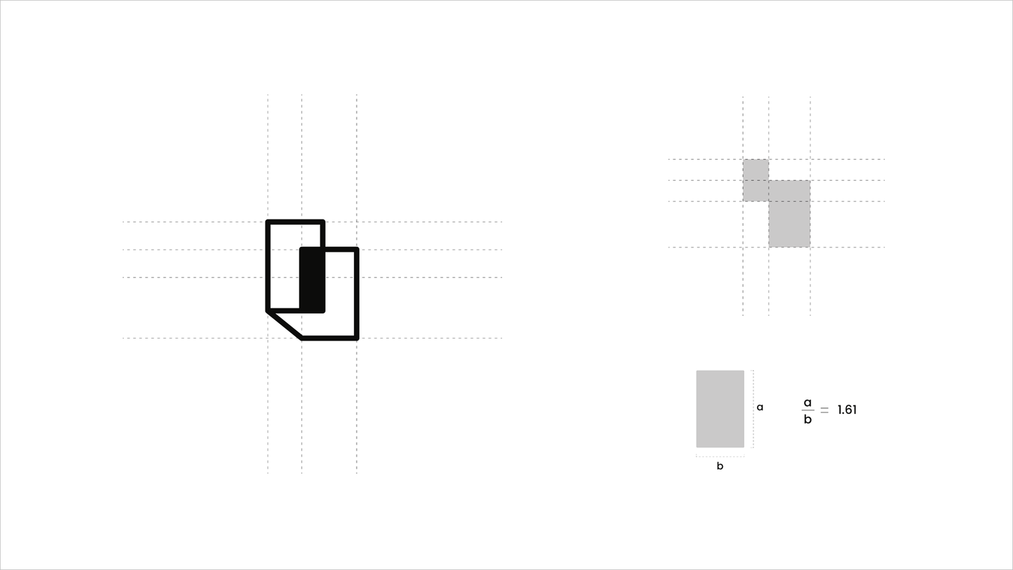
The brand icon of the “Arturs Team” brand has been constructed by combining two rectangles, where the aspect ratio is approximately 1.61 – the value of the golden ratio.
Mistrz&Małgorzata
The practical part of my bachelor’s thesis. Supervised by Ewa Potocka, PhD., 2021
The idea of creating a logo for the “Mistrz&Malgorzata Confectionery” brand arose from a longstanding passion for creating sweets.
The brand icon somewhat references confectionery products by depicting a donut, while on the other hand, it directs the branding towards a purely cosmic theme, transforming the donut into a truly “sweet planet”.

Mistrz&Małgorzata
The brand icon of the Mistrz&Malgorzata has been constructed based on circles, with their diameters forming a sequence of Fibonacci numbers (following the principles of the golden ratio).
The brand icon was ultimately rotated by 27 degrees – in accordance with the tilt of Saturn’s rotational axis.
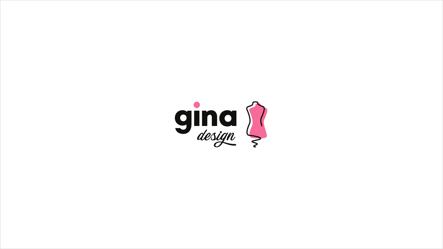
Gina Design
The brand identity prepared for the tailoring studio combines modernity with the stylistic elements characteristic of this environment – typography reminiscent of threads and sewing, as well as the inclusion of a dressmaker’s mannequin in the brand icon.